


OBJECTIVE: To design an automated, online marketing platform for small, local business owners to create, track, and manage digital marketing campaigns.
MY ROLE: UX/UI Designer
(end-to-end design + branding including naming)
DURATION: 4 months
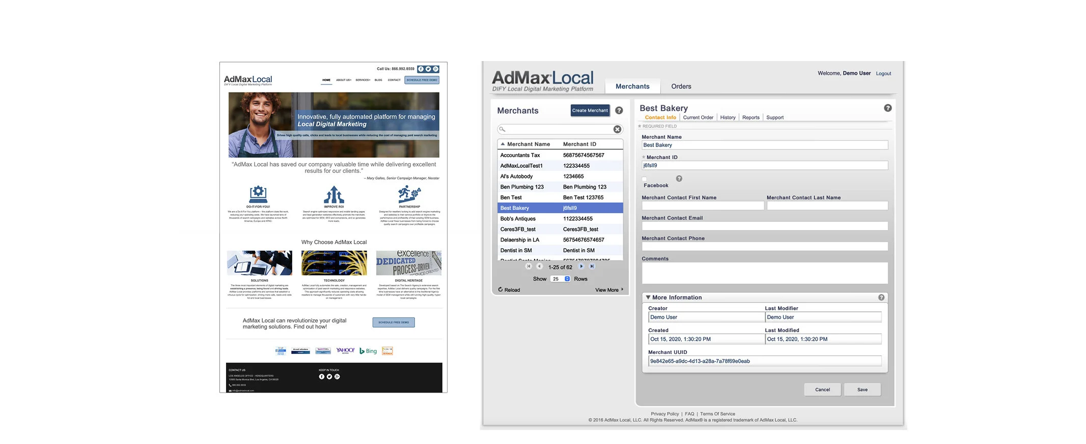
Ad Max Local, a small digital marketing company, already offered some services to small and mid-size, local business owners but wanted to expand on those offerings and modernize their brand look and feel.
The company had a dated landing page and unintuitive demo platform that targeted small marketing teams rather than independent small business owners, an audience that Ad Max Local strategically wanted to capture.
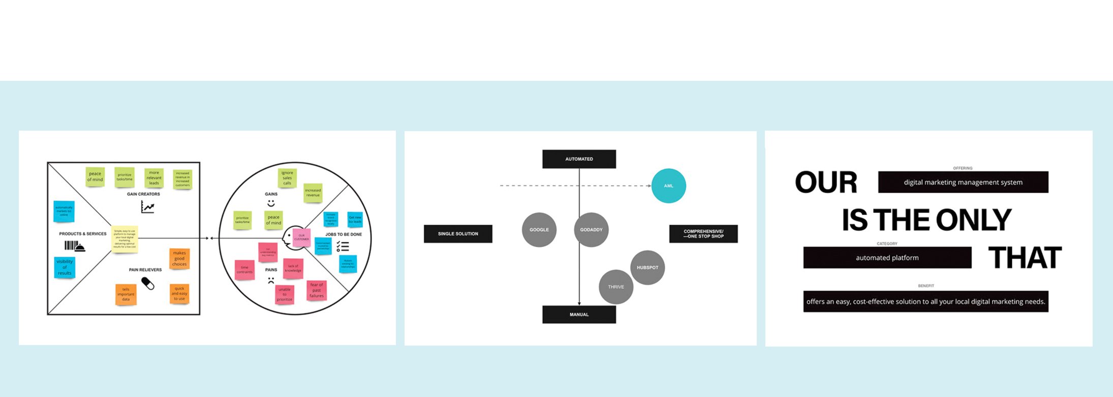
To gain a better understanding of the client’s business goals, the key competitors, and the problems the company believed the product would solve for customers, I organized and conducted a series of interactive, brand exercises for the main stakeholders and decision-makers.
To validate and add to the client’s input, I conducted customer interviews with ethnically diverse participants between the ages of 25-55, who were either soloprenuers or small business owners with 5 or more employees.
Main Takeaways
• Low risks options, like free trial periods, were strongly preferred
• Ease of use, cost-effectiveness, and time efficiency were key
• Typical customer had an average comfort level with technology
• UI had to be clean, streamlined with simple, minimal navigation
• Copy content had to be direct and concise
• Sign-up to ad launch process had to be quick
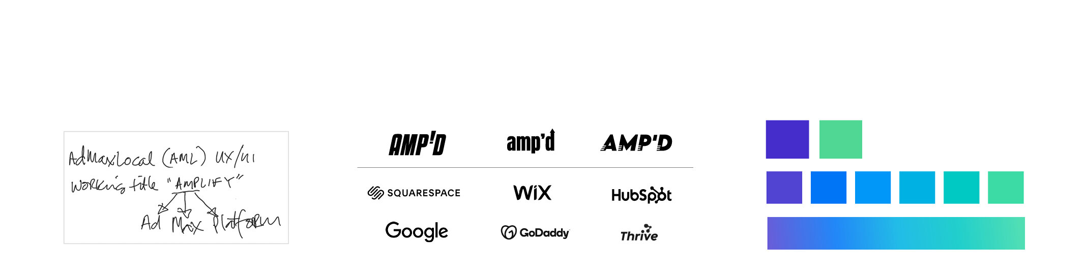
Once I had a better understanding of whom I was designing for, I ran a tight, 2-week design sprint, during which I honed the brand personality and voice, as well as developed a name, logo, and color palette for the platform.
AMP'D equals Ad Max Platform Direct It is short for AMPLIFIED, which means to make greater, increase, extend, or expand.
The name speaks to the customer’s tangible benefits: greater revenue due to customer growth, extended business leads, increased site visits, expanded brand recognition, and more peace of mind.
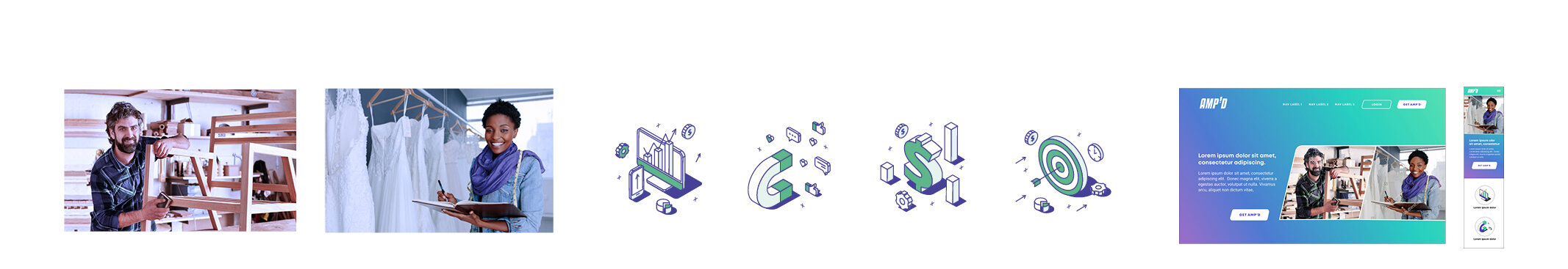
After the foundational brand elements were approved, I determined the photography and illustration styles and began exploring brand design directions before landing on the system above.
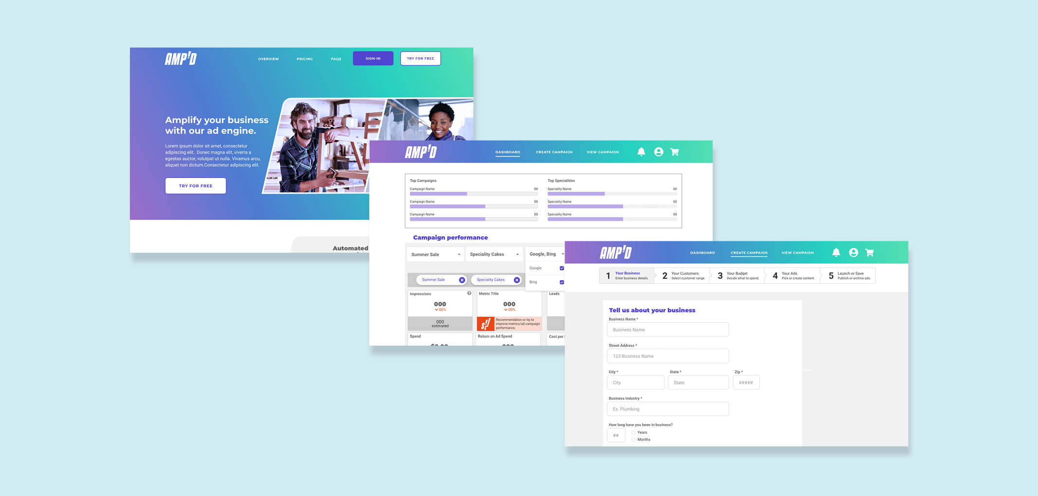
With the brand look and feel established, I began developing the design system and first focused on the fundamentals: the grid system, typefaces and typographic scale, color palettes, and icons. From the foundation to the UI elements, everything is made to look and feel streamlined and simplified in order to be inviting and unintimidating.
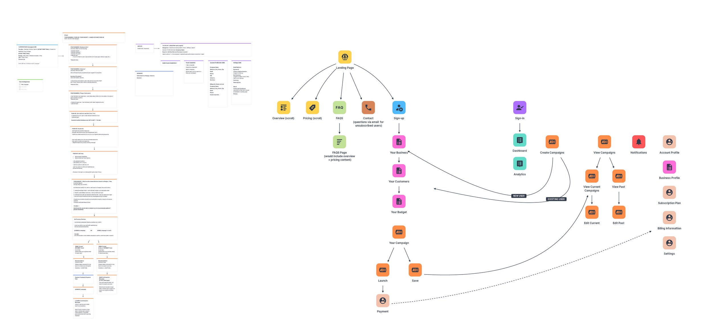
Based on the platform requirements and user stories provided by the client, I was able to think through additional user scenarios, draft userflows, and develop a site map to help the client and development team see how features would be integrated. This process and documention also was crucial in establishing the designer-development sprint cycles and identifying any additional content and components.
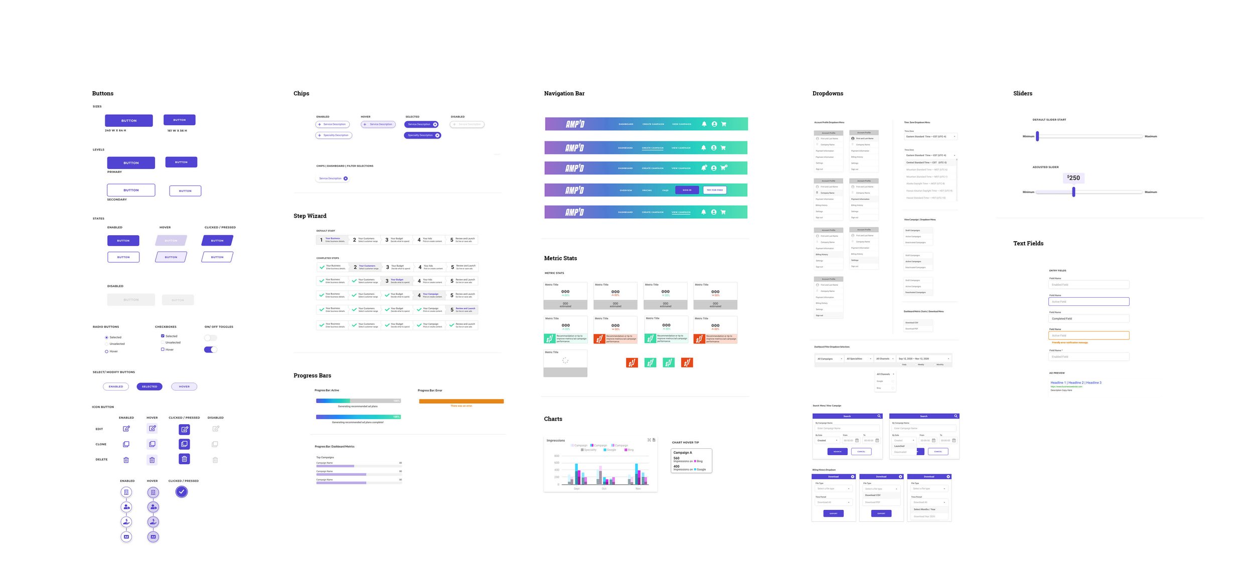
For each product segment (onboarding, ad creation, profile, settings, dashboard, payment), I roughed out and shared wireframes with the client and dev team every other week for discussion and approvals before moving on to high-fidelity prototypes.
Each sprint cycle, once wireframes were approved, I designed and added components to the design system so that the dev team could begin working with these assets. The design system, however, remained a living, breathing document throughout the process. I synced and managed all updates through Zeroheight.
In addition to the clean, friendly components, the following interaction design elements help keep the onboarding process streamlined and simple:
• a step wizard appears at the top of the screen throughout the onboarding process
• disabled selections guide the input flow
• a tethered/fixed navigation is always visible
• back-to-top links eliminate long page scrolls
• intuitive, interactive sliders, and progress bars provide immediate selection and status feedback
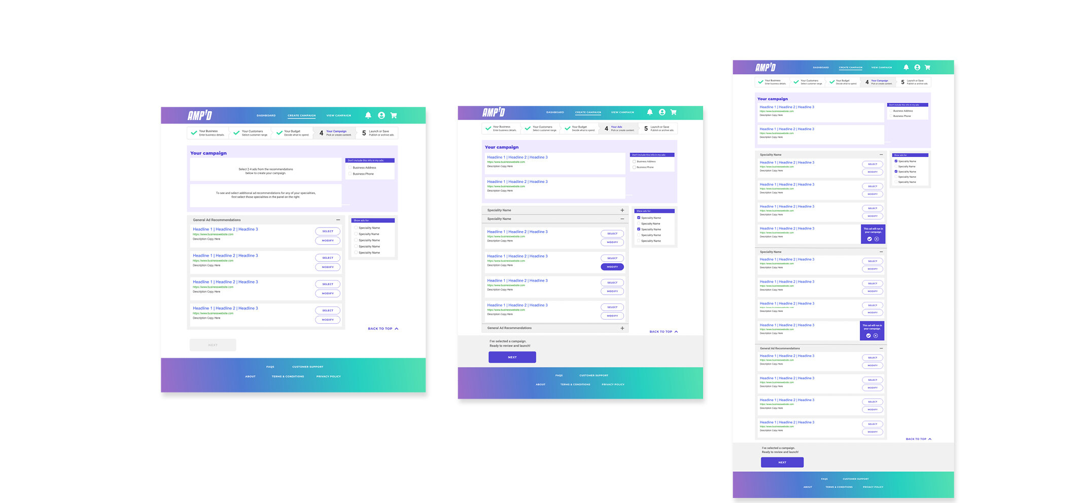
For the MVP and free trial, word-based ads would be the only option available; while Google and Bing would be the initial channels. Based on its keyword data, the platform took the minimal user input gathered in the onboarding process and generated variations of what should be the highest performing ads. User could select from the recommended drafts to create ad campaigns. All ads were editable and customizable through easy-to-use drop and drag ad modification functionality.
The use of clear error indications, bright, isometric vector illustration—when not distracting to CTAs—and upbeat, encouraging copy enhanced the intuitive and friendly tone.
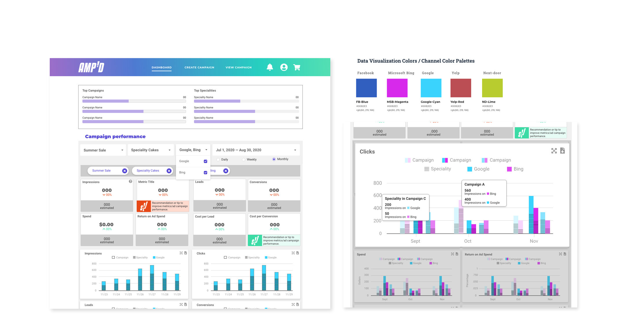
To make the dashboard easy-to-use and interpret, at-a-glance stats were prominently positioned at the top and filters for campaigns, specialities, and date ranges were made fully customizable. In addition, all charts were expandable with hover tips for data points, as well as key terms for definitions.
I also suggested and created a feature called Amp’d Alerts, for which positive and negative performance indicators were visibly indicated along with recommendations for how to improve or maintain the ad campaign results.
I set-up biweekly user-testing on the high-fidelity prototypes for each segment of the platform. Items tested included: design preferences, navigation organization and labeling, and chart styles for optimal data comprehension.