
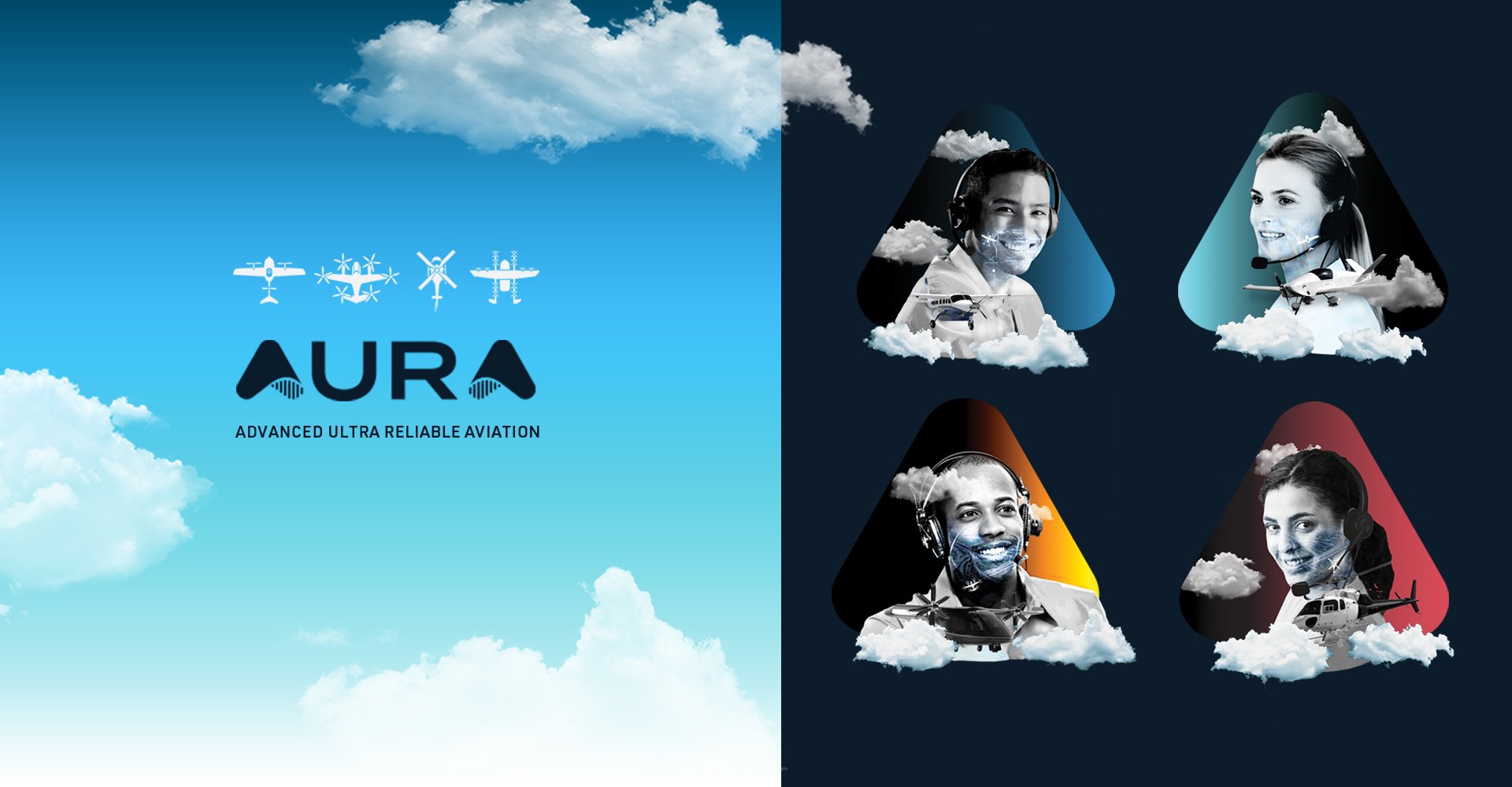


As a contract design director, I built the company brand and product style guidelines from the ground up and expanded the visual assets to include custom brand imagery, illustrations, and icons that strategicially positioned and distinguished AURA from the competition.
An amp cord and waves are integrated into a sleek typeface to produce a unique, edgy logo with technical appeal. Bright, cool duotones are used to energize black and white imagery that highlights the site features.
For the logo mark, I created a round, geometric typeface that mirrored the doughy, filled dumplings. The shape of the letter D doubled for the menu trifold, die-cut, as well as a secondary graphic pattern for the packaging.
DAQRI wanted a clever t-shirt design for their holiday giveaway.
The founder had an interest in the brand evolution of legendary companies and liked the idea of creating a fictional, yet plausible, development of the company’s identity throughout the 20th century. To plan a systematic transition to the current logo, I focused on the major technological advancements of the times and considered the typographic and design styles of each decade.